Hey there DAMOUSLY ,
Your analytics look good. Tracking's working. But people still aren't buying.
What's the problem?
Usually? It's your UX.
I've audited hundreds of stores. The ones making serious money all follow the same principles. The ones bleeding visitors? They ignore them.
Let me show you the ten UX principles that actually move the needle.
1. Mobile-First Design
Your customers are on their phones. Not at desks. Not on laptops.
If your site looks broken on mobile, you're losing sales before they even start.
The fix: Design for small screens first. Fluid layouts. Simple menus. Big, touch-friendly buttons.
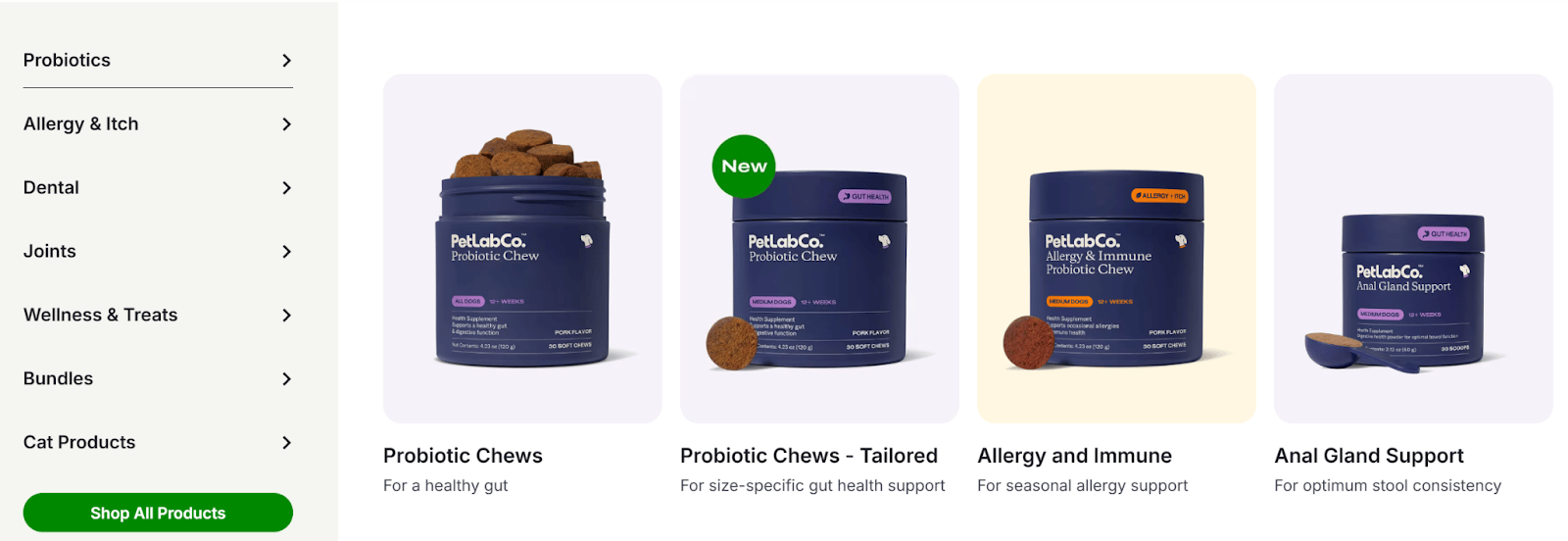
Petlab does this perfectly. Their mobile site adapts seamlessly—no pinching, no zooming, no frustration.
(A professional CRO audit catches these mobile friction points before they cost you sales. See what's broken on your site →)
2. Clear Value Proposition
You have five seconds to tell visitors why they should care.
If they can't figure out what you sell and why it matters, they're gone.
The fix: Put your value prop front and center. Use simple language. Make it visual.
AG1 nails this: "Your Daily Nutrient Boost." That's it. Clear. Simple. Effective.
3. Optimized Site Speed
Every second your site takes to load, you lose customers.
Amazon found that every 100ms delay costs them 1% in sales. Your store isn't different.
The fix: Compress images. Use a CDN. Enable caching.
If I can't find what I want in three clicks, I'm leaving.
The fix: Clear menus. Visible search. Smart filters that actually work.
Petlab uses mega menus that show everything at once. Zalando's filters let you narrow down thousands of products in seconds.
Both make shopping stupid easy. And easy shopping means more sales.
5. Streamlined Checkout
Cart abandonment averages 70%. Know why?
Because checkouts suck.
Too many fields. Forced account creation. No idea how many steps are left.
The fix: Offer guest checkout. Minimize form fields. Show a progress bar.
Nike lets you check out without an account. Frans Hals Museum's store shows exactly how many steps remain.
You can tell me your product is amazing. I won't believe you.
But if 500 customers say it? Now we're talking.
The fix: Put reviews on product pages. Show real ratings. Display testimonials.
Dore and Rose puts customer reviews everywhere. Trust goes up. Sales follow.

7. Accessible Design
Better contrast. Alt text. Keyboard navigation.
These aren't nice-to-haves. They're must-haves.
Accessible design means more people can use your site. More people means more money.
8. Multiple Payment Options
I want to pay with Apple Pay. You only take PayPal.
Sale lost.
The fix: Offer every payment method your customers actually use. Credit cards. Digital wallets. Buy now, pay later.
OOKIOH displays all major payment options. Shoppers have choice. Friction drops. Conversions rise.
9. Visual Hierarchy
Your visitors' eyes follow a path. You should control that path.
The fix: Make important stuff bigger, bolder, more colorful. Push secondary content to the background.
10. Consistent Branding
Every page should feel like it's from the same store.
Same colors. Same fonts. Same voice.
Consistency builds trust. Trust builds sales.
Dollar Shave Club's rustic aesthetic is everywhere. You know you're on their site the second you land.
Professional audits spot brand inconsistencies that erode trust without you realizing it. Get your brand consistency check
Exclusive Offer for DAMOUSLY subscribers.: 50% Off Your CRO Audit
I usually charge $1000 for a complete CRO audit.
But you're on this list. So you get it for $499.
Here's what you get:
Complete UX and conversion analysis
Analytics health check (because broken data = broken decisions)
Funnel leak detection (where visitors bail and why)
Prioritized action plan (what to fix first for maximum impact)
Video walkthrough explaining everything
This isn't some automated report. It's me, personally, going through your site and finding the exact spots where you're losing money.
This 50% discount is exclusively for newsletter subscribers.
Spots are limited. I only take a handful of these each week.


